Scroll down
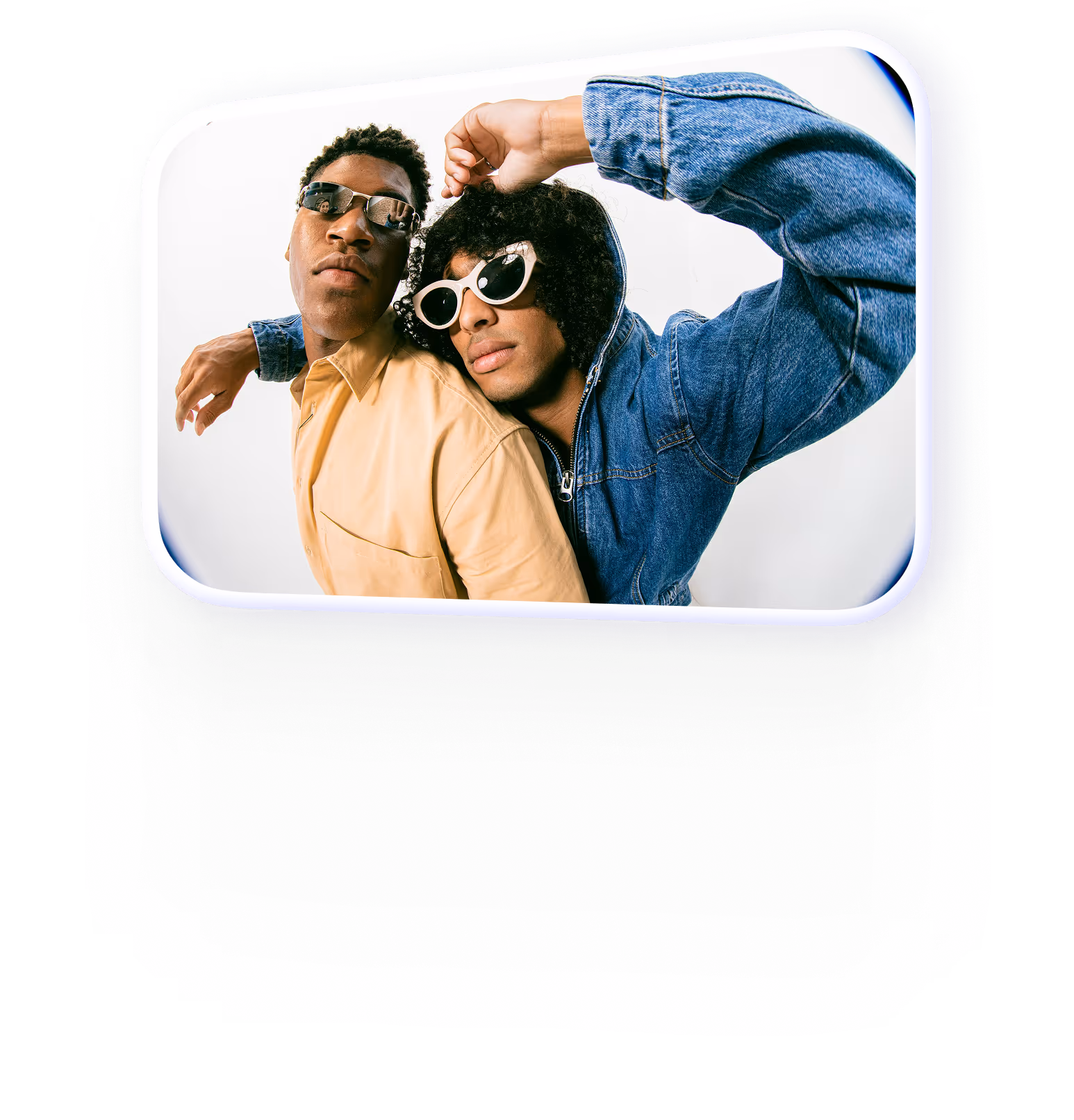
New bold redesign created by Embacy
With Embacy we've reimagined our brand, giving it an additional human touch and visual flexibility for international markets.


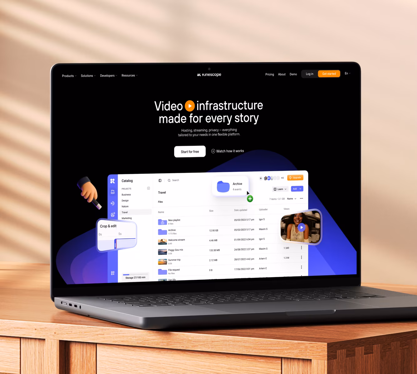
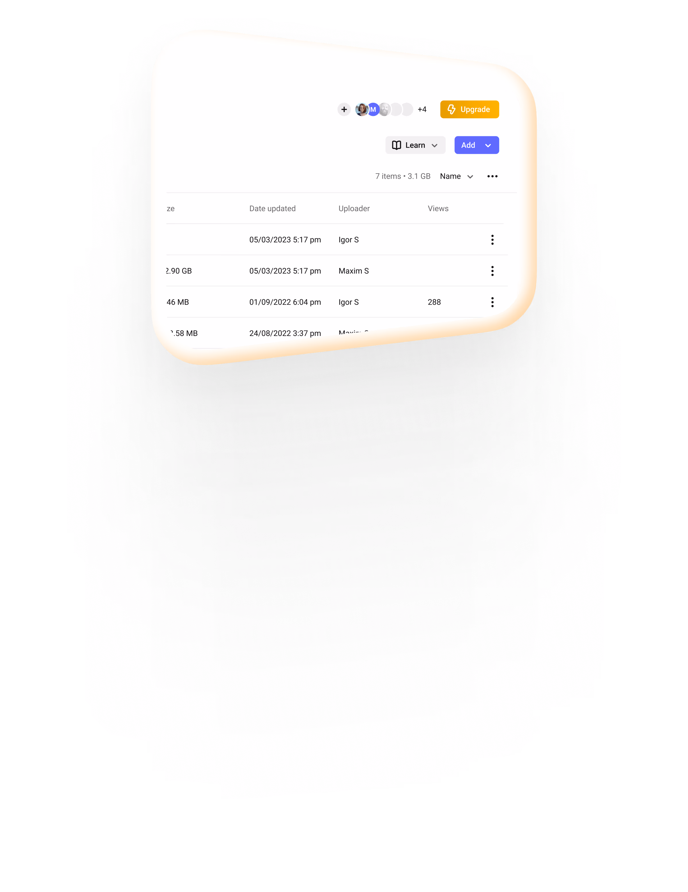
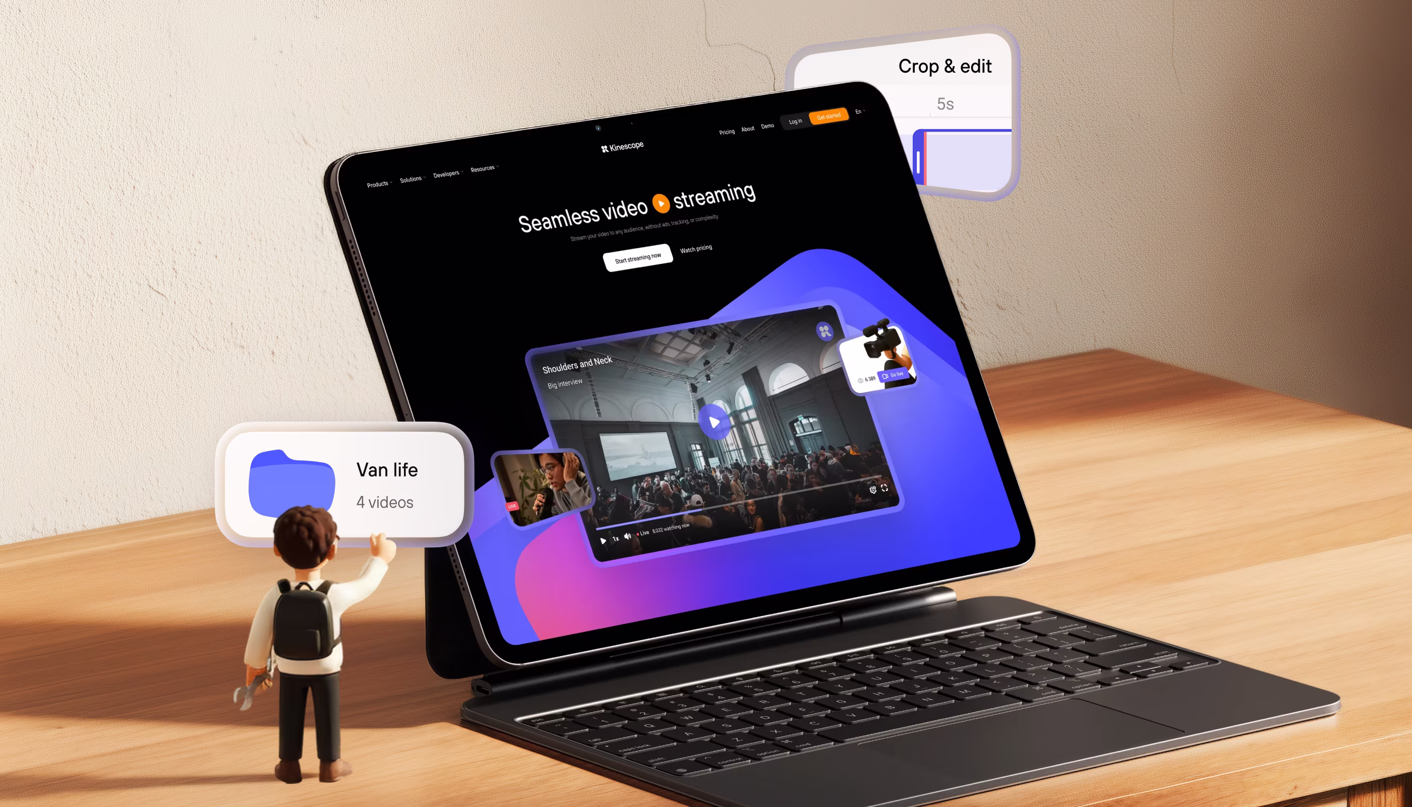
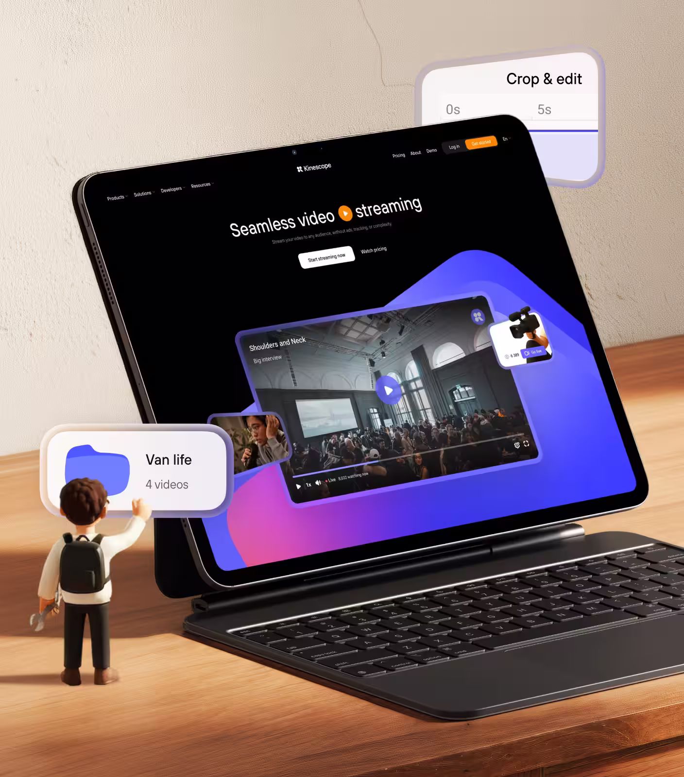
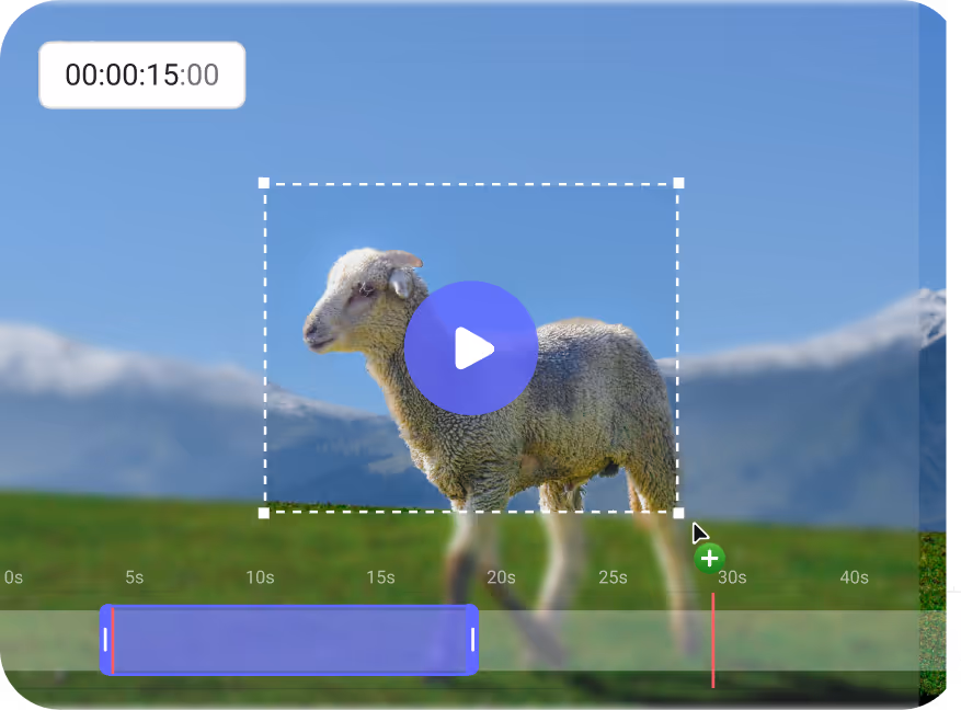
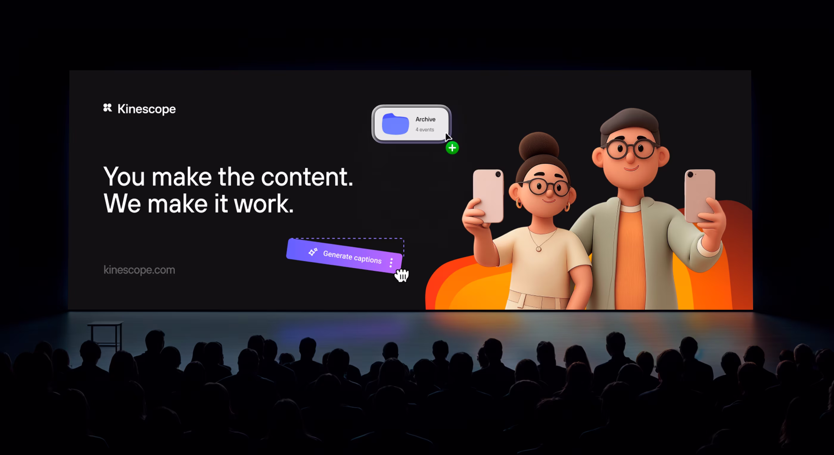
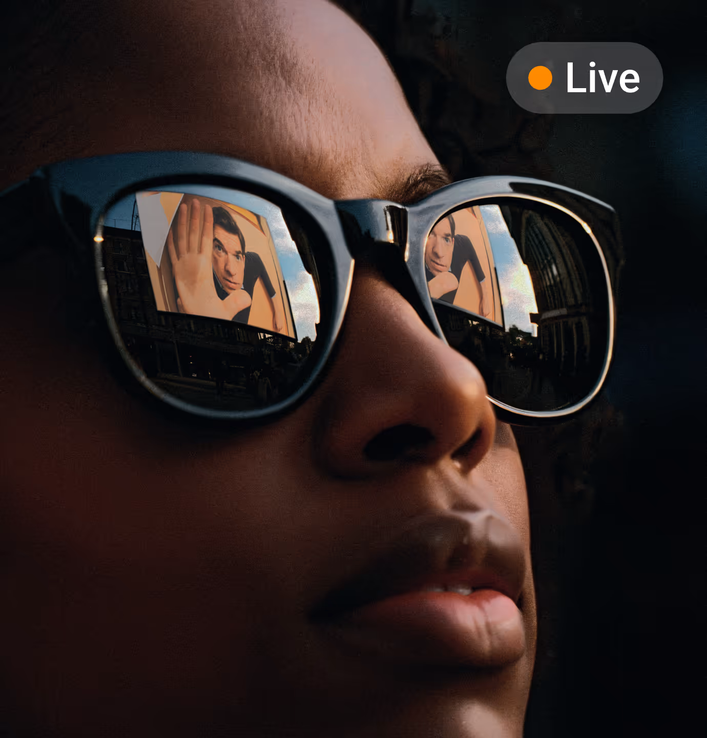
Complete video ecosystem right at your fingertips


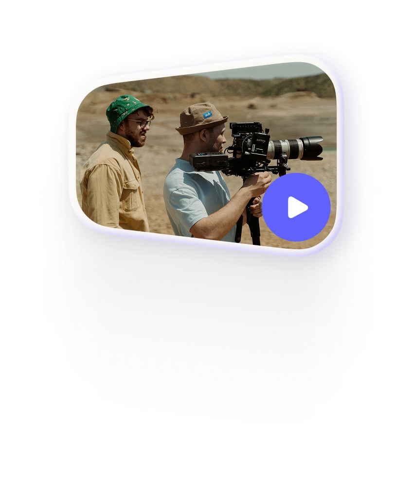
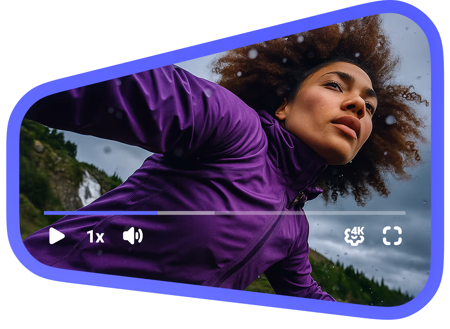
Player

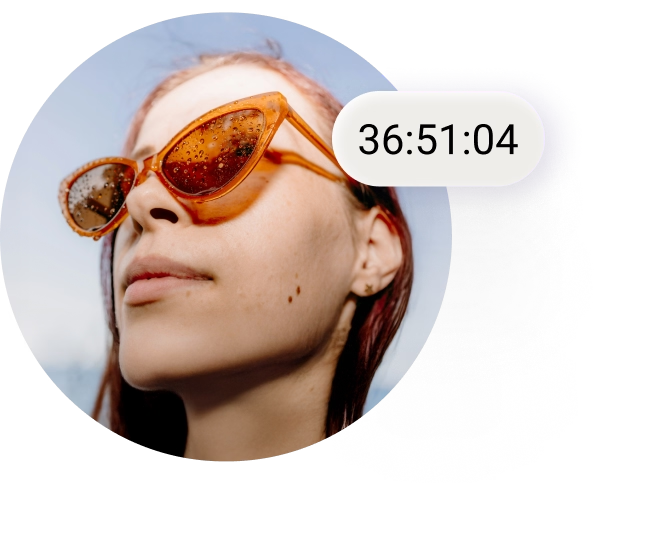
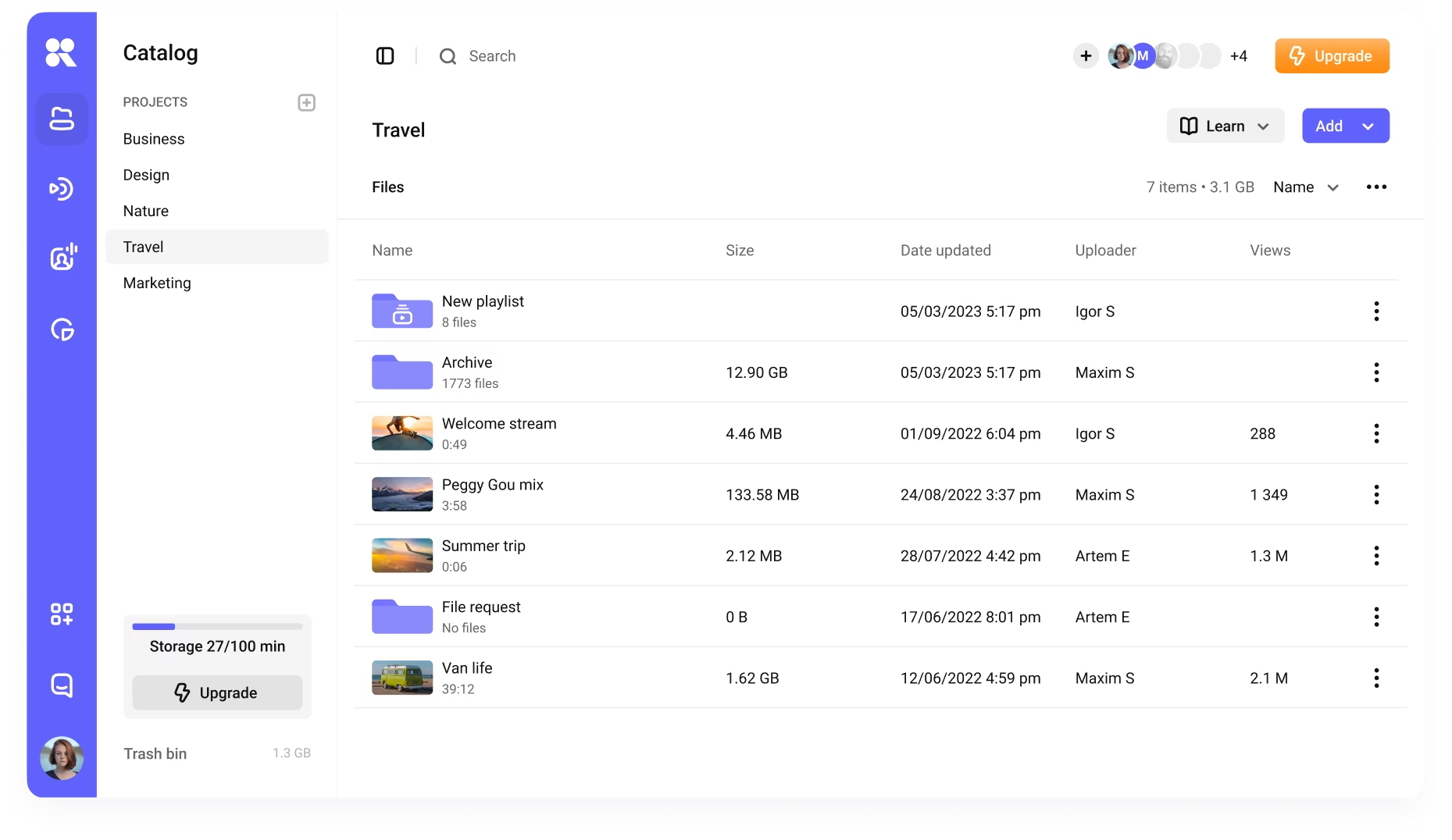
Hosting

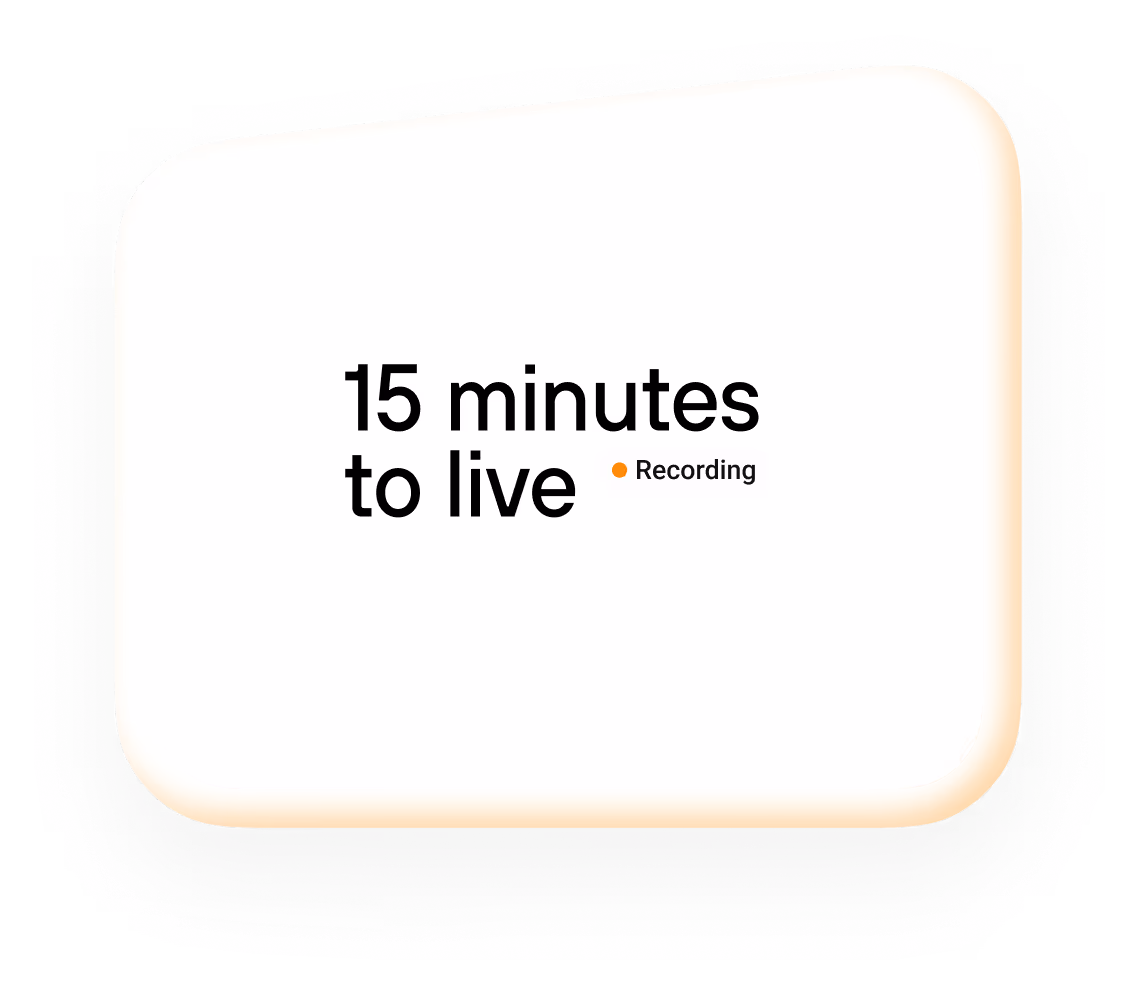
Streaming
Analytics
We

Our thoughts on rebranding
Kinescope is expanding globally. We're now focusing on unique content and creators, guided by a balance of progress and empathy — values reflected in our new design. The shape of the kinescope lens became
00:02:54:43
the perfect symbol of this vision.
00:02:54:43

Alex Pavlychev
Founder at Kinescope
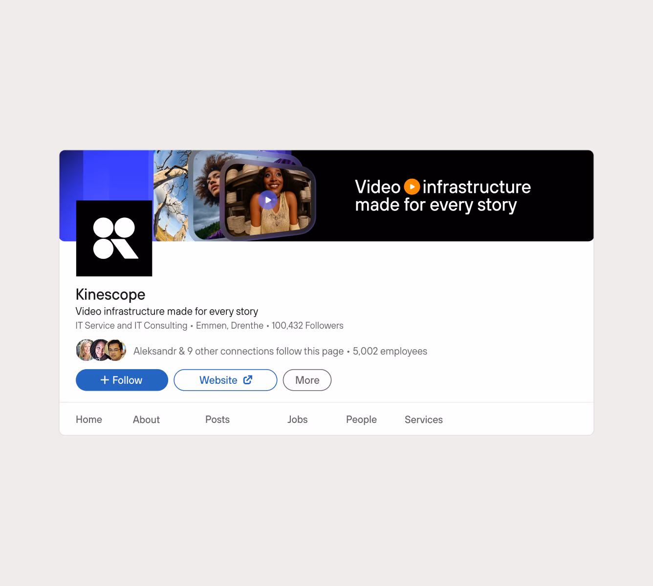
We keep our logo simple — black and white. So it could stay recognisable anywhere. Always.
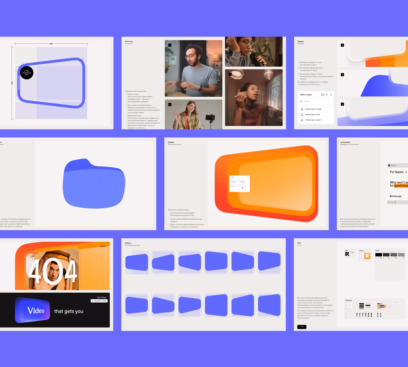
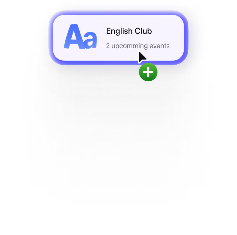
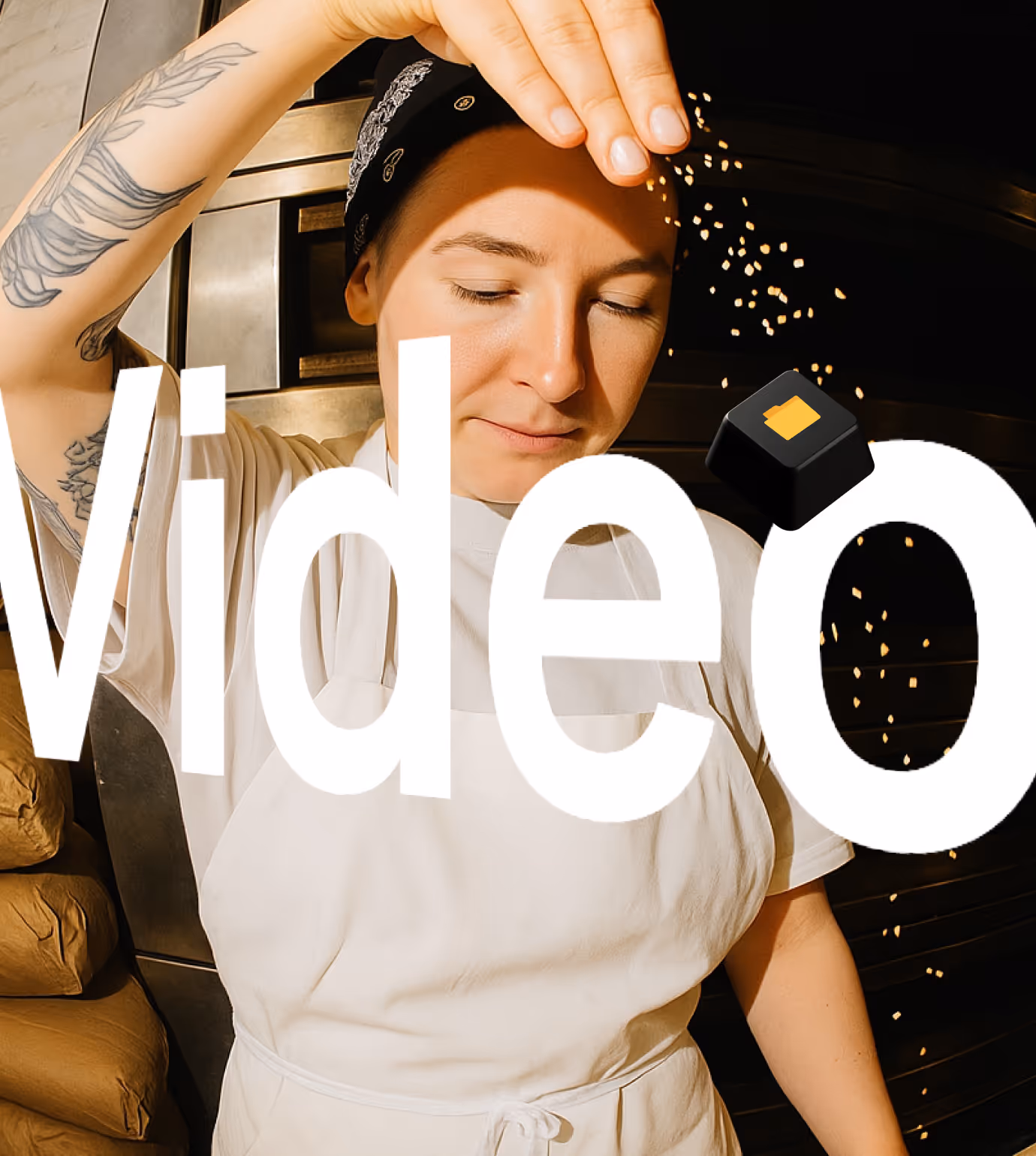
Flexible lens now faces the creators and adapts to their needs


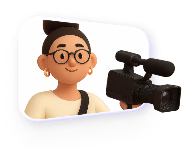
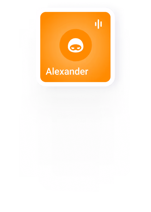
Accompanied by little helper-companions
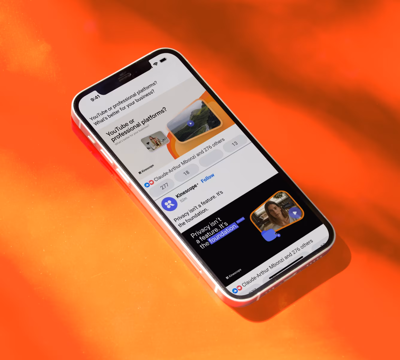
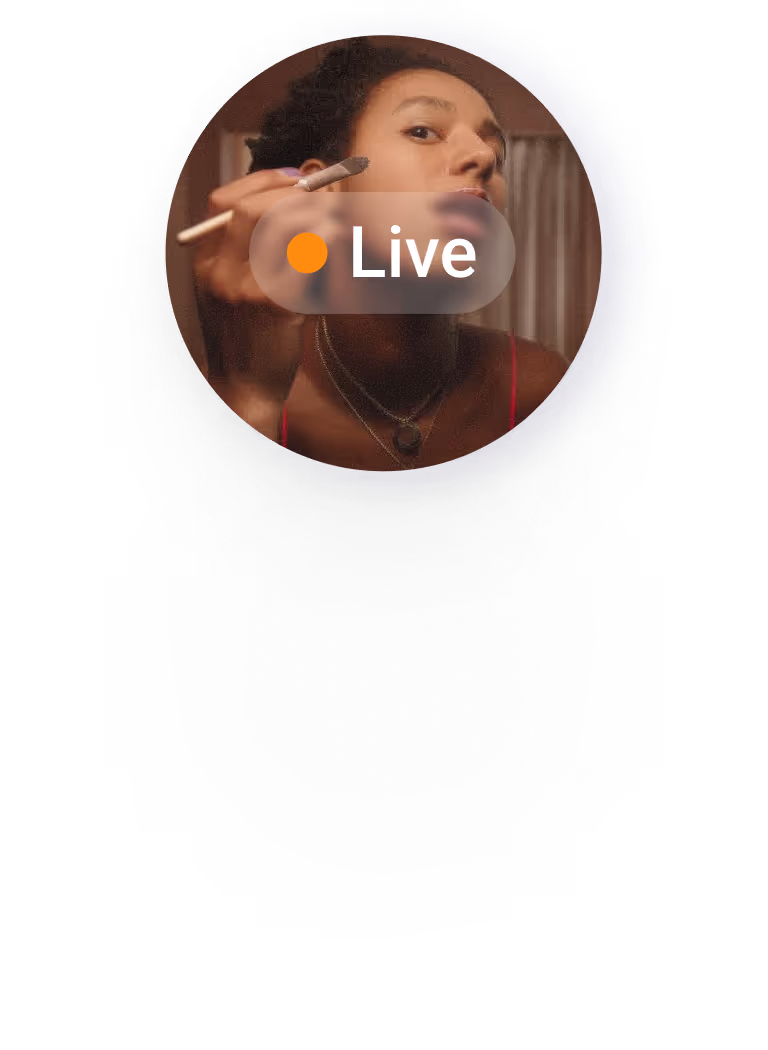
We use violet as a product color and color of key features
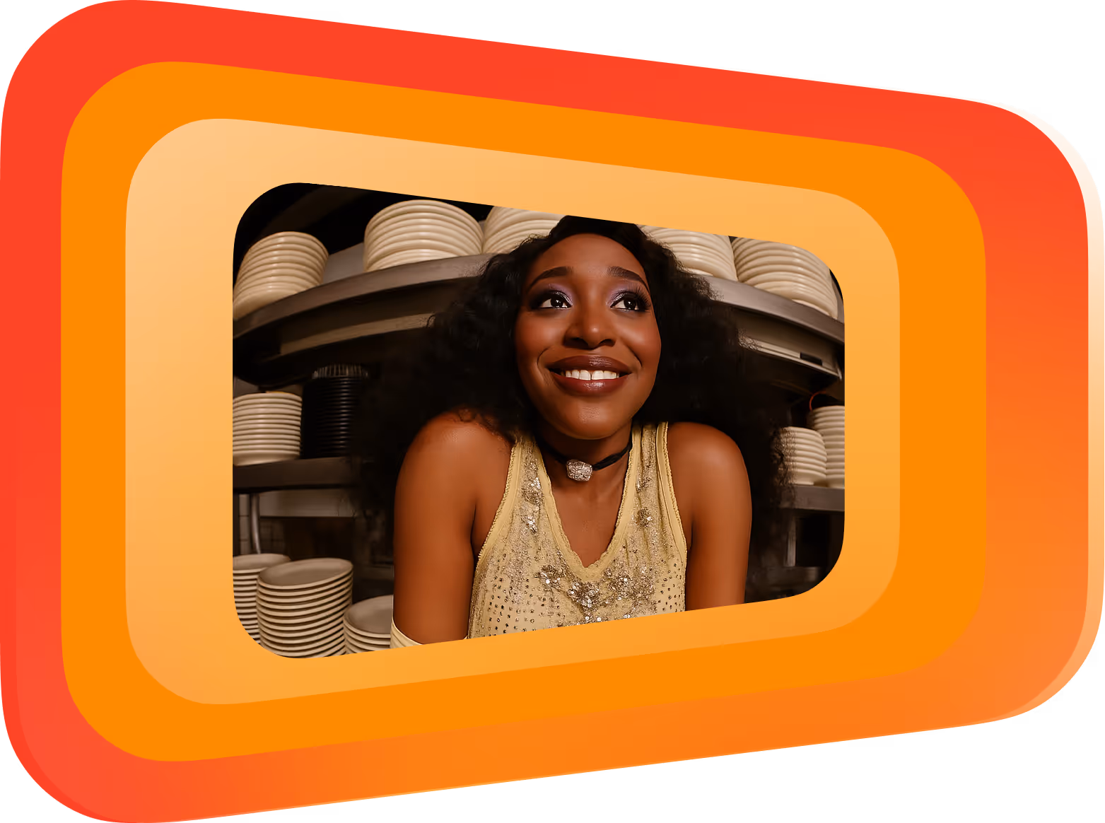
We use orange as a brand color, highlighting what matters the most
Beige is the ultimate warm and friendly background colour


Say hi to
TT Hoves Pro Compact

Branding with limitless possibilities


Explore our